The Art of Timeless Branding: Exploring the Best Logo Designs of All Time
A logo is more than just an image; it is the visual cornerstone of a brand’s identity, a silent ambassador that communicates values, vision, and purpose in a single glance. In a world saturated with visual information, a truly great logo cuts through the noise, embedding itself in the collective consciousness and standing the test of time. But what elevates a design from merely good to undeniably iconic? Is it simplicity, a compelling backstory, or an uncanny ability to resonate across generations and cultures?
This comprehensive guide delves into the fascinating world of best logo designs, dissecting the elements that contribute to their enduring success. We’ll explore the fundamental principles of timeless logo design, uncover the psychological underpinnings of visual appeal, and showcase a curated selection of logos that have not only defined their respective brands but have also influenced the broader landscape of graphic design. From the minimalist elegance of a bitten apple to the dynamic sweep of a sports apparel giant, prepare to discover the secrets behind the most iconic logos ever conceived and understand why they continue to captivate and inspire. Whether you’re a budding designer, a brand strategist, or simply curious about the power of visual communication, this article will illuminate the art and science behind truly unforgettable branding.

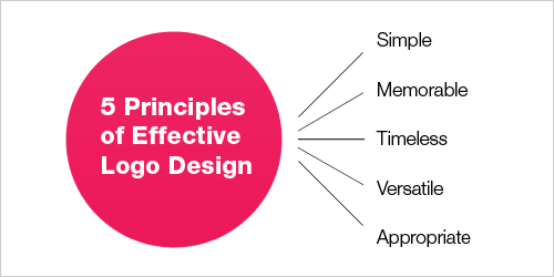
What Makes a Logo Timeless? Principles of Great Logo Design
The quest for the “best” logo design is inherently subjective, yet there are objective principles that consistently underpin designs that achieve widespread recognition and longevity. These aren’t just aesthetic preferences; they are strategic choices that ensure a logo remains relevant, effective, and impactful for decades, if not centuries. Understanding these core tenets is crucial for anyone aspiring to create or appreciate truly great logo design.

Simplicity: The Essence of Memorability
Perhaps the most critical principle, simplicity dictates that a logo should be easy to recognize, recall, and describe. Overly complex designs can confuse the viewer, making them difficult to remember and reproduce. Think of the most iconic logos: they often feature minimal elements, clean lines, and a straightforward message. A simple logo is inherently versatile and adaptable, making it suitable for various applications, from a tiny app icon to a large billboard.
Key Takeaway: A simple logo is not simplistic; it’s refined, focused, and powerful in its directness.

Memorability: Sticking in the Mind’s Eye
A logo’s effectiveness is directly tied to how easily people can remember it. This often goes hand-in-hand with simplicity, but it also involves distinctiveness. A memorable logo stands out from the competition, possessing a unique quality that prevents it from blending into the background. It creates an instant connection, fostering recognition and recall even after a brief encounter. This distinctiveness can come from a unique shape, an unexpected color combination, or a clever visual pun.

Versatility: Adapting to Any Medium
In today’s multi-channel world, a logo must perform flawlessly across an astonishing array of platforms. It needs to look good on a smartphone screen, a business card, a product package, a television commercial, and even embroidered on merchandise. This demands a design that scales without losing clarity, works in various color palettes (including black and white), and maintains its integrity whether animated or static. A versatile logo ensures consistent brand presentation, regardless of the context.

Appropriateness: Speaking to the Target Audience
An effective logo must be appropriate for the brand it represents and its target audience. While a playful, whimsical logo might be perfect for a children’s toy company, it would be entirely unsuitable for a law firm. The visual language—colors, fonts, shapes—should align with the industry, brand values, and the emotional connection the brand seeks to establish with its consumers. An appropriate logo builds trust and communicates professionalism or personality effectively.
Timelessness: Enduring the Test of Trends
Trends come and go, but the best logo designs transcend fleeting fads. A timeless logo avoids trendy fonts, color schemes, or graphic styles that will quickly appear dated. Instead, it relies on fundamental design principles and a classic aesthetic that remains relevant and fresh for years to come. Designing for timelessness means thinking long-term, ensuring the logo will still resonate with future generations and continue to represent the brand faithfully.
Distinctiveness: Standing Out from the Crowd
In a crowded marketplace, a logo must differentiate a brand from its competitors. It needs to be unique and instantly recognizable, avoiding generic imagery or clichés. A distinctive logo helps a brand carve out its own identity, making it easier for consumers to identify and choose it over others. This uniqueness is a crucial component of building a strong brand identity and fostering loyalty.
The Unforgettable Few: Iconic Logos and Their Legacy
Having established the principles, let’s explore some of the most enduring and iconic logos that exemplify these traits. These designs are not merely pretty pictures; they are strategic masterpieces that have profoundly shaped global culture and commerce. Each tells a story of innovation, recognition, and unwavering brand power.
Nike: The Swoosh – Simple, Dynamic, Victorious
* Year Created: 1971
- Designer: Carolyn Davidson
- Design Principles: Simplicity, dynamism, movement. The “Swoosh” is said to represent the wing of the Greek goddess Nike (victory) and the sound of speed.
- Impact: One of the most recognizable logos globally, the Swoosh has become synonymous with athleticism, achievement, and aspiration. Its fluid, upward curve perfectly embodies motion and victory. It’s so powerful that Nike often omits the brand name entirely, relying solely on the symbol for recognition.
- Designer: Rob Janoff
- Design Principles: Simplicity, clean lines, subtle narrative. The bite is rumored to prevent it from being confused with a cherry and also references the biblical story of the apple of knowledge, or perhaps even Isaac Newton’s apple.
- Impact: The Apple logo is a masterclass in minimalist design and intellectual intrigue. It’s instantly recognizable and evokes a sense of sophistication, user-friendliness, and cutting-edge technology. The transition from rainbow to monochromatic underscored Apple’s shift to a more mature, elegant brand identity.
- Designer: Frank M. Robinson (John Pemberton’s bookkeeper)
- Design Principles: Classic typography, fluidity, heritage. The Spencerian script was a popular form of penmanship in the 19th century, giving the logo an elegant, traditional feel.
- Impact: The Coca-Cola logo is arguably the most recognized wordmark in the world. Its distinctive script has remained virtually unchanged for over a century, embodying timelessness and tradition. It’s a testament to the power of unique typography to build an enduring brand identity that transcends language barriers.
- Designer: Stanley Meston (original restaurant architecture), Jim Schindler (modernized logo)
- Design Principles: Bold geometric shapes, vibrant color, brand association. The “M” forms two golden arches, initially part of the restaurant’s architecture, which were later stylized into the iconic logo.
- Impact: The Golden Arches are a beacon of fast food and one of the most powerful brand symbols globally. They evoke feelings of familiarity, convenience, and a consistent experience. The bright yellow color is known to stimulate appetite and happiness, contributing to its widespread appeal.
- Designer: Gottlieb Daimler (family)
- Design Principles: Simplicity, symbolism, aspiration. The three points represent Daimler’s ambition for motorization “on land, on water, and in the air.”
- Impact: The Mercedes-Benz star is a powerful emblem of luxury, engineering prowess, and reliability. It’s a symbol of aspiration and success, instantly communicating premium quality and German precision. Its elegant simplicity ensures it looks equally impressive on a car grille or a corporate document.
- Designer: Ruth Kedar (original), Google’s in-house design team (current)
- Design Principles: Friendly typography, vibrant color palette, adaptability. The current sans-serif wordmark is clean, modern, and highly legible, reflecting Google’s commitment to accessibility.
- Impact: The Google logo, particularly its current iteration, embodies approachability and innovation. Its playful use of primary colors (with a green “l” as an outlier) suggests creativity and a breaking of norms. The logo’s ability to adapt into “Doodles” for special occasions further enhances its dynamic and engaging personality.
- Designer: Lindon Leader of Landor Associates
- Design Principles: Clever negative space, subtle messaging, visual wit. The arrow hidden between the “E” and “x” symbolizes speed, precision, and forward momentum.
- Impact: The FedEx logo is celebrated for its ingenious use of negative space. The hidden arrow is a subtle yet powerful reinforcement of the company’s core values: speed and accuracy in delivery. Once seen, it cannot be unseen, making it an incredibly memorable and intelligent design that communicates without explicit words.
- Designer: Turner Duckworth
- Design Principles: Dual symbolism, warmth, comprehensive offering. The arrow pointing from ‘A’ to ‘Z’ signifies that Amazon sells everything from A to Z, while simultaneously forming a smile, representing customer satisfaction.
- Impact: The Amazon logo is a brilliant example of how simple elements can convey multiple powerful messages. The smile evokes happiness and approachability, while the A-to-Z arrow subtly communicates the vastness of Amazon’s product catalog. It’s a friendly yet highly effective visual representation of a global e-commerce giant.
- Designer: Terry Heckler (original), Lippincott (simplified)
- Design Principles: Mythological symbolism, evolution, brand story. The
Apple: The Bitten Apple – Knowledge, Temptation, Innovation
* Year Created: 1977 (rainbow version by Rob Janoff), 1998 (monochromatic)
Coca-Cola: The Spencerian Script – Heritage, Refreshment, Universality
* Year Created: 1887
McDonald’s: The Golden Arches – Familiarity, Comfort, Global Presence
* Year Created: 1968 (initial arches in 1953)
Mercedes-Benz: The Three-Pointed Star – Domination, Luxury, Excellence
* Year Created: 1909
Google: The Dynamic Wordmark – Innovation, Accessibility, Playfulness
* Year Created: 1998 (original), 2015 (current)
FedEx: The Hidden Arrow – Efficiency, Precision, Forward Motion
* Year Created: 1994
Amazon: The Smile/Arrow – Customer Satisfaction, Vast Selection
* Year Created: 2000
Starbucks: The Siren – Allure, Community, Premium Experience
* Year Created: 1971 (original), 1987, 1992, 2011 (current simplified version)

Leave a Reply