Author: @_admin

  • Unveiling the Best Logo Designs of All Time: The Art of Enduring Identity

    Unveiling the Best Logo Designs of All Time: The Art of Enduring Identity

    The Art of Enduring Identity: Unveiling the Best Logo Designs of All Time

    In a world saturated with visual information, a logo stands as the silent ambassador of a brand, a powerful symbol that can transcend language, culture, and time. It’s more than just a pretty picture; it’s the distilled essence of a company’s values, mission, and promise. But what elevates a logo from mere graphic to an iconic masterpiece, one that resonates across generations and becomes etched into our collective consciousness? Is it simplicity, memorability, or perhaps a hidden message that sparks intrigue?

    From the deceptively simple swoosh to the intricately crafted script, the best logo designs in history share common threads of ingenuity, strategic thinking, and a profound understanding of human perception. These aren’t just corporate emblems; they are cultural touchstones, instantly recognizable symbols that evoke emotion, trust, and a sense of belonging. They tell stories without uttering a single word, building invaluable brand equity and fostering loyalty that can last a lifetime.

    This comprehensive exploration delves into the fascinating world of iconic logo design, dissecting the fundamental principles that underpin their enduring success. We will embark on a journey through the pantheon of visual branding, examining the legendary logos that have defined industries and shaped our visual landscape. Discover the hidden genius behind their creation, learn what makes them universally appealing, and uncover the invaluable lessons they offer to aspiring designers and businesses alike. Prepare to be inspired by the timeless power of exceptional graphic design and understand why these chosen few stand as testaments to the art of enduring identity.

    What Makes a Logo Truly Great? The Pillars of Iconic Design
    Source: www.amazon.com

    What Makes a Logo Truly Great? The Pillars of Iconic Design

    Before we delve into specific examples, it’s crucial to understand the foundational principles that elevate a logo from good to truly great. An iconic logo isn’t born by chance; it’s the result of meticulous thought, creative vision, and a deep understanding of psychology and market dynamics. These pillars ensure that a logo not only looks appealing but also performs its critical function: to identify, differentiate, and communicate.

    Simplicity: The Power of Less
    Source: www.amazon.com

    Simplicity: The Power of Less

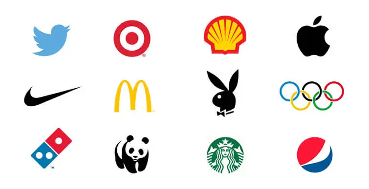
    The adage “less is more” holds profound truth in logo design. Simple logos are inherently easier to recognize, recall, and reproduce across diverse mediums. They avoid clutter, focusing instead on a singular, powerful idea or form. Think of the elegance of the Apple logo or the immediate recognition of Nike’s Swoosh. Their power lies in their ability to convey a complex message with minimal visual elements. A simple design reduces cognitive load, allowing the viewer’s brain to process and store the image effortlessly.

    Key Takeaway: A simple logo is not simplistic; it is distilled. It removes all non-essential elements to reveal the core essence.
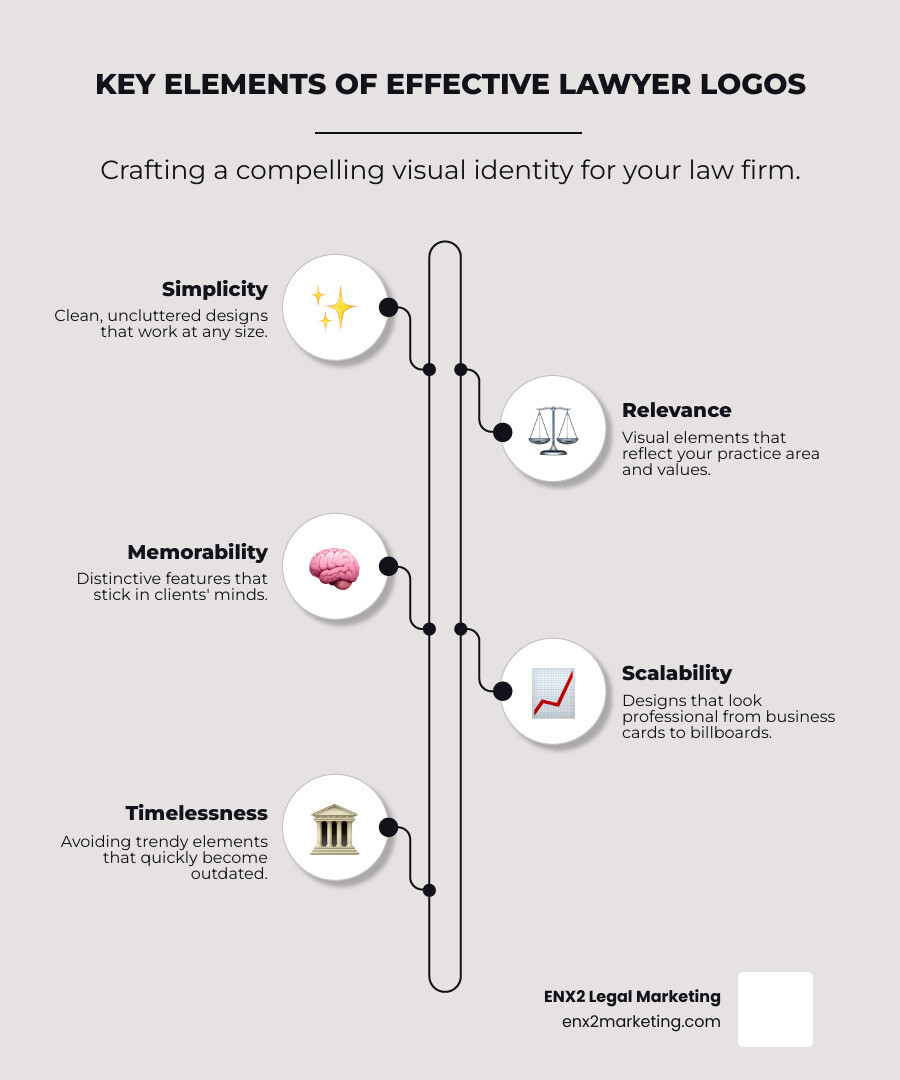
    Memorability: Sticking in the Mind

    A great logo is unforgettable. It possesses a unique quality that makes it stand out from the myriad of other visual stimuli we encounter daily. Memorability is often a direct result of simplicity, but it also stems from distinctiveness and cleverness. Whether it’s a unique shape, a distinctive typeface, or a subtle visual trick, a memorable logo creates a lasting impression. This recall value is paramount for brand recognition, allowing consumers to quickly identify and associate with a company even at a glance.

    Versatility: Adaptable Across Platforms
    Source: www.freepik.com

    Versatility: Adaptable Across Platforms

    In today’s multi-channel world, a logo must be incredibly versatile. It needs to look equally impactful on a billboard, a tiny app icon, a website header, a product package, or even embroidered on a uniform. This means it should be effective in various sizes, colors (including monochrome), and orientations. A truly great logo maintains its integrity and impact regardless of the medium, ensuring consistent brand representation across all touchpoints. This adaptability is a hallmark of modern logo design excellence.

    Timelessness: Enduring Through Eras

    Trends come and go, but iconic logos endure. They avoid fleeting fads, opting instead for classic, fundamental design principles that remain relevant over decades, even centuries. A timeless logo doesn’t need constant redesigns to stay fresh; its core appeal is intrinsic and resistant to the whims of fashion. Consider the Coca-Cola script or the Mercedes-Benz star – designs that have remained largely unchanged for generations, testifying to their inherent strength and enduring appeal.

    Appropriateness: Resonating with the Brand

    While a logo doesn’t need to explicitly show what a company does (e.g., a car logo doesn’t have to be a car), it must be appropriate for the brand’s industry, values, and target audience. A children’s toy company might use playful colors and whimsical shapes, while a law firm would opt for something more serious and established. The logo should feel “right” for the brand it represents, aligning with its personality and communicating its core essence effectively. This alignment builds credibility and trust with the intended audience.

    The Pantheon of Iconic Logos: Case Studies in Excellence

    Now, let’s explore some of the most celebrated and effective logo designs in history. These examples perfectly embody the principles discussed above, demonstrating how thoughtful design can create an indelible mark on the world. Each logo tells a unique story of innovation, cultural impact, and enduring visual power.

    Apple: The Bite-Sized Icon of Innovation


    Classic Apple rainbow logo and modern monochrome Apple logo
    The Apple logo is arguably one of the most recognized corporate symbols globally. Its journey began with a complex illustration of Isaac Newton under an apple tree, quickly replaced by Rob Janoff’s iconic bitten apple in 1977. The bite, initially thought to prevent confusion with a cherry, also cleverly plays on the computer term “byte.” The original rainbow stripes conveyed the Apple II’s color capabilities and a sense of approachability, a stark contrast to the sterile tech world of the time. As Apple matured, the logo evolved, shedding its colors for a sleek, monochromatic, and often translucent or metallic look. This minimalist shift reflected Apple’s refined design philosophy and premium brand positioning. The Apple logo’s power lies in its extreme simplicity, memorability, and the almost mythical status it has acquired, representing innovation, user-friendliness, and cutting-edge design. It’s a testament to how a simple form can embody a complex brand identity.

    Nike: The Swoosh of Victory


    Nike swoosh logo
    Designed by Carolyn Davidson in 1971 for a mere $35, the Nike “Swoosh” is a masterpiece of dynamic simplicity. Inspired by the wing of the Greek goddess of victory, Nike, the logo conveys movement, speed, and athleticism. Its fluid, upward-curving line suggests momentum and forward progress, perfectly aligning with the brand’s message of aspiration and achievement. The Swoosh is incredibly versatile, working flawlessly on shoes, apparel, and advertising, often standing alone without the brand name – a true sign of its iconic status. It’s a prime example of a logo that has transcended its initial purpose to become a universal symbol of excellence and ambition. The story of its creation and subsequent global recognition is often cited as an inspiration for aspiring designers, proving that profound impact isn’t always tied to a hefty initial price tag.

    McDonald’s: The Golden Arches of Global Recognition


    McDonald's golden arches logo
    The Golden Arches of McDonald’s are instantly recognizable worldwide, a powerful symbol of fast food and global consumer culture. Introduced in 1968, the “M” logo was a simplification of the architectural golden arches that adorned McDonald’s early restaurants. This design choice was brilliant; it took a physical element of their stores and distilled it into a graphic mark that became synonymous with the brand. The bold yellow color evokes happiness, warmth, and hunger, while the simple, rounded shape is friendly and approachable. The Golden Arches are more than just a logo; they are a beacon, a consistent promise of familiar food and experience, whether you’re in Times Square or Tokyo. Their enduring presence speaks to their extraordinary memorability and cultural penetration, making them one of the most impactful logos in history.

    Coca-Cola: The Script That Endures


    <img src="cocacolalogo.png” alt=”Coca-Cola script logo”>
    The Coca-Cola logo, designed by Frank M. Robinson in 1886, is a testament to the power of timeless typography. Written in the distinctive Spencerian script, a popular handwriting style of the era, it exudes elegance, tradition, and authenticity. What’s remarkable is how little the logo has changed over 130 years, maintaining its classic charm and immediate recognition. Its flowing, connected letters suggest continuity and a rich heritage, perfectly aligning with Coca-Cola’s narrative of a refreshing, enduring beverage. The vibrant red color further enhances its visibility and evokes energy and excitement. The Coca-Cola logo is a masterclass in how a well-crafted wordmark can become an iconic symbol, proving that sometimes, the most effective design is one that cherishes its origins and resists the urge to constantly reinvent itself.

    FedEx: The Hidden Arrow of Efficiency


    FedEx logo with hidden arrow
    The FedEx logo, designed by Lindon Leader in 1994, is celebrated for its clever use of negative space. At first glance, it appears to be a straightforward wordmark. However, a closer look reveals a perfectly formed white arrow nestled between the “E” and the “X.” This hidden arrow brilliantly symbolizes speed, precision, and forward momentum – core values of a logistics and delivery company. It’s a subtle yet powerful design element that adds depth and memorability without sacrificing simplicity. The intelligent use of two distinct colors for “Fed” (purple) and “Ex” (orange/red, which changes based on the division like FedEx Express, Ground, Freight) further aids differentiation while maintaining brand consistency. The FedEx logo is a prime example of how a designer can embed a compelling message within a seemingly simple form, rewarding attentive viewers with a moment of discovery.

    Mercedes-Benz: The Three-Pointed Star of Aspiration


    <img src="mercedesbenzlogo.png” alt=”Mercedes-Benz three-pointed star logo”>
    The Mercedes-Benz three-pointed star, first registered in 1909, is a symbol of unparalleled luxury, engineering excellence, and global ambition. The three points famously represent the company’s aim to motorize land, sea, and air – a bold vision that speaks to innovation and dominance. Encased within a circle, the star exudes a sense of prestige, perfection, and exclusivity. Its clean, geometric form is timeless and versatile, equally impactful on a car grille, marketing materials, or a corporate building. The silver color often associated with it further reinforces its premium status, suggesting quality, sophistication, and technological prowess. The Mercedes-Benz star is more than just a logo; it’s an emblem of aspiration, a universally understood symbol of ultimate automotive craftsmanship and status that has remained virtually unchanged for over a century.

    Google: The Playful Evolution of a Digital Giant


    Google wordmark logo
    The Google logo, while essentially a wordmark, is iconic for its playful use of color and its remarkable adaptability. Since its inception in 1998, the logo has undergone several subtle refinements, moving from a slightly skeuomorphic, serif-font design to its current clean, geometric sans-serif typeface. The primary colors (blue, red, yellow, green) are used in a distinctive, non-sequential pattern, suggesting a playful departure from rigid rules and reflecting Google’s innovative, user-centric approach. What makes the Google logo particularly notable is its dynamic nature, especially through “Doodles” that celebrate holidays, historical events, and prominent figures. This ability to temporarily transform while retaining its core identity showcases exceptional versatility and engagement. The Google logo embodies the spirit of a company that is both massive and approachable, constantly evolving yet consistently recognizable.

    Starbucks: The Siren’s Call to Coffee Culture


    Starbucks siren logo
    The Starbucks logo, featuring a twin-tailed siren, is a captivating and distinctive mark that evokes the brand’s origins and its global reach. Inspired by a Norse woodcut, the siren initially appeared in a more elaborate, brown design in 1971. Over the decades, it has been progressively simplified, shedding its full body and becoming more stylized and iconic. The current green and white version, adopted in 2011, is a minimalist yet powerful representation. The siren’s enigmatic gaze and flowing hair convey a sense of allure, mystery, and connection to the sea, nodding to Seattle’s port city heritage and the idea of coffee as a journey. The logo’s distinctiveness has allowed Starbucks to remove its name from the emblem, relying solely on the siren to represent its global coffee empire. It’s a prime example of how a unique, mythological figure can be transformed into a universally recognized brand symbol.

    WWF: The Enduring Panda of Conservation


    <img src="wwfpandalogo.png” alt=”WWF panda logo”>
    The World Wildlife Fund (WWF) logo, featuring a giant panda, is one of the most effective and emotionally resonant non-profit logos ever created. Designed by Sir Peter Scott in 1961, inspired by Chi-Chi, a giant panda at the London Zoo, its strength lies in its simplicity, memorability, and powerful symbolism. The panda, an endangered species, immediately communicates the organization’s mission of wildlife conservation. Its black and white design makes it economical to reproduce and universally recognizable, transcending language barriers.

  • Timeless Logo Design: Unveiling the Most Iconic Logos that Transcend Generations

    Timeless Logo Design: Unveiling the Most Iconic Logos that Transcend Generations

    The Art of Timeless Branding: Exploring the Best Logo Designs of All Time

    A logo is more than just an image; it is the visual cornerstone of a brand’s identity, a silent ambassador that communicates values, vision, and purpose in a single glance. In a world saturated with visual information, a truly great logo cuts through the noise, embedding itself in the collective consciousness and standing the test of time. But what elevates a design from merely good to undeniably iconic? Is it simplicity, a compelling backstory, or an uncanny ability to resonate across generations and cultures?

    This comprehensive guide delves into the fascinating world of best logo designs, dissecting the elements that contribute to their enduring success. We’ll explore the fundamental principles of timeless logo design, uncover the psychological underpinnings of visual appeal, and showcase a curated selection of logos that have not only defined their respective brands but have also influenced the broader landscape of graphic design. From the minimalist elegance of a bitten apple to the dynamic sweep of a sports apparel giant, prepare to discover the secrets behind the most iconic logos ever conceived and understand why they continue to captivate and inspire. Whether you’re a budding designer, a brand strategist, or simply curious about the power of visual communication, this article will illuminate the art and science behind truly unforgettable branding.

    What Makes a Logo Timeless? Principles of Great Logo Design

    The quest for the “best” logo design is inherently subjective, yet there are objective principles that consistently underpin designs that achieve widespread recognition and longevity. These aren’t just aesthetic preferences; they are strategic choices that ensure a logo remains relevant, effective, and impactful for decades, if not centuries. Understanding these core tenets is crucial for anyone aspiring to create or appreciate truly great logo design.

    Simplicity: The Essence of Memorability

    Perhaps the most critical principle, simplicity dictates that a logo should be easy to recognize, recall, and describe. Overly complex designs can confuse the viewer, making them difficult to remember and reproduce. Think of the most iconic logos: they often feature minimal elements, clean lines, and a straightforward message. A simple logo is inherently versatile and adaptable, making it suitable for various applications, from a tiny app icon to a large billboard.

    Key Takeaway: A simple logo is not simplistic; it’s refined, focused, and powerful in its directness.

    Memorability: Sticking in the Mind’s Eye

    A logo’s effectiveness is directly tied to how easily people can remember it. This often goes hand-in-hand with simplicity, but it also involves distinctiveness. A memorable logo stands out from the competition, possessing a unique quality that prevents it from blending into the background. It creates an instant connection, fostering recognition and recall even after a brief encounter. This distinctiveness can come from a unique shape, an unexpected color combination, or a clever visual pun.

    Versatility: Adapting to Any Medium

    In today’s multi-channel world, a logo must perform flawlessly across an astonishing array of platforms. It needs to look good on a smartphone screen, a business card, a product package, a television commercial, and even embroidered on merchandise. This demands a design that scales without losing clarity, works in various color palettes (including black and white), and maintains its integrity whether animated or static. A versatile logo ensures consistent brand presentation, regardless of the context.

    Appropriateness: Speaking to the Target Audience

    An effective logo must be appropriate for the brand it represents and its target audience. While a playful, whimsical logo might be perfect for a children’s toy company, it would be entirely unsuitable for a law firm. The visual language—colors, fonts, shapes—should align with the industry, brand values, and the emotional connection the brand seeks to establish with its consumers. An appropriate logo builds trust and communicates professionalism or personality effectively.

    Timelessness: Enduring the Test of Trends

    Trends come and go, but the best logo designs transcend fleeting fads. A timeless logo avoids trendy fonts, color schemes, or graphic styles that will quickly appear dated. Instead, it relies on fundamental design principles and a classic aesthetic that remains relevant and fresh for years to come. Designing for timelessness means thinking long-term, ensuring the logo will still resonate with future generations and continue to represent the brand faithfully.

    Distinctiveness: Standing Out from the Crowd

    In a crowded marketplace, a logo must differentiate a brand from its competitors. It needs to be unique and instantly recognizable, avoiding generic imagery or clichés. A distinctive logo helps a brand carve out its own identity, making it easier for consumers to identify and choose it over others. This uniqueness is a crucial component of building a strong brand identity and fostering loyalty.

    The Unforgettable Few: Iconic Logos and Their Legacy

    Having established the principles, let’s explore some of the most enduring and iconic logos that exemplify these traits. These designs are not merely pretty pictures; they are strategic masterpieces that have profoundly shaped global culture and commerce. Each tells a story of innovation, recognition, and unwavering brand power.

    Nike: The Swoosh – Simple, Dynamic, Victorious

    * Year Created: 1971

      1. Designer: Carolyn Davidson
      2. Design Principles: Simplicity, dynamism, movement. The “Swoosh” is said to represent the wing of the Greek goddess Nike (victory) and the sound of speed.
      3. Impact: One of the most recognizable logos globally, the Swoosh has become synonymous with athleticism, achievement, and aspiration. Its fluid, upward curve perfectly embodies motion and victory. It’s so powerful that Nike often omits the brand name entirely, relying solely on the symbol for recognition.
      4. Apple: The Bitten Apple – Knowledge, Temptation, Innovation

        * Year Created: 1977 (rainbow version by Rob Janoff), 1998 (monochromatic)

      5. Designer: Rob Janoff
      6. Design Principles: Simplicity, clean lines, subtle narrative. The bite is rumored to prevent it from being confused with a cherry and also references the biblical story of the apple of knowledge, or perhaps even Isaac Newton’s apple.
      7. Impact: The Apple logo is a masterclass in minimalist design and intellectual intrigue. It’s instantly recognizable and evokes a sense of sophistication, user-friendliness, and cutting-edge technology. The transition from rainbow to monochromatic underscored Apple’s shift to a more mature, elegant brand identity.
      8. Coca-Cola: The Spencerian Script – Heritage, Refreshment, Universality

        * Year Created: 1887

      9. Designer: Frank M. Robinson (John Pemberton’s bookkeeper)
      10. Design Principles: Classic typography, fluidity, heritage. The Spencerian script was a popular form of penmanship in the 19th century, giving the logo an elegant, traditional feel.
      11. Impact: The Coca-Cola logo is arguably the most recognized wordmark in the world. Its distinctive script has remained virtually unchanged for over a century, embodying timelessness and tradition. It’s a testament to the power of unique typography to build an enduring brand identity that transcends language barriers.
      12. McDonald’s: The Golden Arches – Familiarity, Comfort, Global Presence

        * Year Created: 1968 (initial arches in 1953)

      13. Designer: Stanley Meston (original restaurant architecture), Jim Schindler (modernized logo)
      14. Design Principles: Bold geometric shapes, vibrant color, brand association. The “M” forms two golden arches, initially part of the restaurant’s architecture, which were later stylized into the iconic logo.
      15. Impact: The Golden Arches are a beacon of fast food and one of the most powerful brand symbols globally. They evoke feelings of familiarity, convenience, and a consistent experience. The bright yellow color is known to stimulate appetite and happiness, contributing to its widespread appeal.
      16. Mercedes-Benz: The Three-Pointed Star – Domination, Luxury, Excellence

        * Year Created: 1909

      17. Designer: Gottlieb Daimler (family)
      18. Design Principles: Simplicity, symbolism, aspiration. The three points represent Daimler’s ambition for motorization “on land, on water, and in the air.”
      19. Impact: The Mercedes-Benz star is a powerful emblem of luxury, engineering prowess, and reliability. It’s a symbol of aspiration and success, instantly communicating premium quality and German precision. Its elegant simplicity ensures it looks equally impressive on a car grille or a corporate document.
      20. Google: The Dynamic Wordmark – Innovation, Accessibility, Playfulness

        * Year Created: 1998 (original), 2015 (current)

      21. Designer: Ruth Kedar (original), Google’s in-house design team (current)
      22. Design Principles: Friendly typography, vibrant color palette, adaptability. The current sans-serif wordmark is clean, modern, and highly legible, reflecting Google’s commitment to accessibility.
      23. Impact: The Google logo, particularly its current iteration, embodies approachability and innovation. Its playful use of primary colors (with a green “l” as an outlier) suggests creativity and a breaking of norms. The logo’s ability to adapt into “Doodles” for special occasions further enhances its dynamic and engaging personality.
      24. FedEx: The Hidden Arrow – Efficiency, Precision, Forward Motion

        * Year Created: 1994

      25. Designer: Lindon Leader of Landor Associates
      26. Design Principles: Clever negative space, subtle messaging, visual wit. The arrow hidden between the “E” and “x” symbolizes speed, precision, and forward momentum.
      27. Impact: The FedEx logo is celebrated for its ingenious use of negative space. The hidden arrow is a subtle yet powerful reinforcement of the company’s core values: speed and accuracy in delivery. Once seen, it cannot be unseen, making it an incredibly memorable and intelligent design that communicates without explicit words.
      28. Amazon: The Smile/Arrow – Customer Satisfaction, Vast Selection

        * Year Created: 2000

      29. Designer: Turner Duckworth
      30. Design Principles: Dual symbolism, warmth, comprehensive offering. The arrow pointing from ‘A’ to ‘Z’ signifies that Amazon sells everything from A to Z, while simultaneously forming a smile, representing customer satisfaction.
      31. Impact: The Amazon logo is a brilliant example of how simple elements can convey multiple powerful messages. The smile evokes happiness and approachability, while the A-to-Z arrow subtly communicates the vastness of Amazon’s product catalog. It’s a friendly yet highly effective visual representation of a global e-commerce giant.
      32. Starbucks: The Siren – Allure, Community, Premium Experience

        * Year Created: 1971 (original), 1987, 1992, 2011 (current simplified version)

      33. Designer: Terry Heckler (original), Lippincott (simplified)
      34. Design Principles: Mythological symbolism, evolution, brand story. The
  • The Best Logos of All Time: Unveiling the Enduring Power of Design

    The Best Logos of All Time: Unveiling the Enduring Power of Design

    The Enduring Power of Design: Unveiling the Best Logos of All Time

    In a world saturated with visual information, a logo stands as a beacon, a silent ambassador for a brand. It’s often the first point of contact, a mnemonic device that evokes emotions, memories, and associations. But what elevates a mere graphic mark to the status of “best logo design in all time”? Is it the simplicity that makes it instantly recognizable, the cleverness that reveals a hidden message, or the sheer longevity that allows it to transcend generations? The answer lies in a masterful blend of these elements, creating an identity that is not just seen, but felt and remembered.

    Great logos are more than just pretty pictures; they are strategic assets that encapsulate a brand’s essence, communicate its values, and forge an unbreakable bond with its audience. They become cultural touchstones, instantly identifiable symbols woven into the fabric of our everyday lives. From the iconic bitten apple to the dynamic swoosh, these designs have achieved a rare kind of immortality, proving that true design brilliance is timeless. This comprehensive article delves into the principles that define an outstanding logo, explores the fascinating stories behind some of the most iconic brand marks ever created, and offers insights into why these specific designs have earned their place in the pantheon of visual communication. Prepare to discover the artistry, strategy, and enduring impact of the logos that have shaped our world.

    What Makes a Logo “The Best”? Defining Excellence in Brand Identity

    Before we embark on a journey through the most celebrated logos, it’s crucial to understand the fundamental principles that elevate a good logo to a truly great, even “best,” one. These aren’t arbitrary rules but rather time-tested guidelines that ensure a logo’s effectiveness and longevity across diverse applications and evolving cultural landscapes.

    Simplicity: The Power of Less for Maximum Impact
    Source: sifo.ai

    Simplicity: The Power of Less for Maximum Impact

    Perhaps the most critical attribute of a world-class logo is simplicity. A simple logo is easy to recognize, remember, and reproduce. It avoids clutter and unnecessary details, allowing its core message to shine through. Think of the universal appeal of basic shapes and clean lines.

    Key Takeaway: A complex logo often confuses rather than communicates. The best designs distill a brand’s essence into its most fundamental visual form.

    Memorability: Sticking in the Mind’s Eye

    A simple logo naturally lends itself to memorability. When a logo is easy to recall, it becomes an instant mental shortcut to the brand it represents. Memorable logos often have a unique twist or a distinctive characteristic that helps them stand out from the crowd. They leave a lasting impression, ensuring that consumers can easily identify and recall the brand even after a brief encounter.

    Versatility: Adapting Across Platforms and Sizes
    Source: www.amazon.com

    Versatility: Adapting Across Platforms and Sizes

    In today’s multi-channel world, a logo must be incredibly versatile. It needs to look equally compelling on a billboard, a tiny app icon, a product label, a website, or a social media profile. This means it must function effectively in various sizes, colors (or monochrome), and contexts without losing its integrity or impact. A truly great logo maintains its visual strength whether it’s embroidered on a uniform or displayed digitally.

    Timelessness: Enduring Through Eras and Trends

    Trends come and go, but the best logos possess a timeless quality. They avoid fads and fleeting styles, opting instead for classic aesthetics that remain relevant for decades, even centuries. A timeless logo doesn’t need constant redesigns; it evolves subtly, if at all, retaining its core identity while adapting to modern sensibilities. This longevity builds trust and recognition over the long term.

    Appropriateness: Aligning with Brand Values and Industry

    A logo must be appropriate for the brand it represents. Its style, colors, and typography should align with the company’s industry, target audience, and overall brand personality. A financial institution, for example, would likely opt for a more conservative, trustworthy aesthetic, while a children’s toy brand might embrace playfulness and vibrant colors. The logo should instantly convey a sense of what the brand is about.

    Uniqueness: Standing Out from the Competitive Landscape

    In a crowded marketplace, a logo must be unique enough to differentiate the brand from its competitors. While drawing inspiration is natural, outright imitation dilutes brand identity and can lead to legal issues. A truly great logo has a distinct character that sets it apart, making the brand instantly recognizable and helping it carve out its own visual territory.

    The Pantheon of Iconic Logos: Case Studies in Design Brilliance

    Now, let’s explore some of the most celebrated and effective logos in history, dissecting what makes them exemplary and why they continue to resonate with audiences worldwide. Each of these logos embodies the principles discussed above, often with a fascinating backstory that highlights the genius behind their creation.

    1. Apple: The Bitten Symbol of Innovation and Simplicity (1977)

    The iconic Apple logo, a bitten apple silhouette.

    When you think of the best logo design in all time, Apple’s iconic bitten apple is almost certainly one of the first images that comes to mind. Originally, Apple’s first logo in 1976 depicted Isaac Newton sitting under an apple tree, a complex and illustrative design that was far from memorable or versatile. Steve Jobs quickly realized the need for something simpler and more modern.

    In 1977, Rob Janoff designed the now-famous rainbow-striped apple, which was later simplified to a monochrome silhouette. The bite, a stroke of genius, solved a critical recognition problem: without it, the apple could easily be mistaken for a cherry or another fruit. It also subtly plays on the word “byte” in computing, adding a layer of cleverness without sacrificing simplicity. The monochrome version, introduced in 1998, further cemented its timeless appeal, allowing it to adapt effortlessly across all Apple products and marketing materials. Its clean lines and elegant form perfectly embody Apple’s commitment to user-friendly design and cutting-edge technology.

    Why it’s one of the best:

      1. Simplicity: A single, recognizable form.
      2. Memorability: The bite makes it uniquely identifiable.
      3. Versatility: Works perfectly in any size, color, or context.
      4. Timelessness: Has remained largely unchanged for decades, transcending trends.
      5. Appropriateness: Conveys elegance, innovation, and user-friendliness.
      6. 2. Nike: The Dynamic “Swoosh” of Athletic Achievement (1971)

        The Nike 'Swoosh' logo, a dynamic checkmark.

        The Nike “Swoosh” is a masterclass in minimalist design and powerful symbolism. Created in 1971 by graphic design student Carolyn Davidson for a mere $35, the Swoosh was initially met with lukewarm reception. However, co-founder Phil Knight saw its potential. The design represents movement, speed, and the wing of Nike, the Greek goddess of victory.

        Its dynamic, fluid shape perfectly encapsulates the energy and aspiration associated with athletic performance. The Swoosh is incredibly simple, yet powerfully evocative. It’s a prime example of how a seemingly basic graphic can become a global icon, instantly recognizable even without the brand name accompanying it. Its enduring success is a testament to its intrinsic connection to the brand’s core values of achievement and pushing boundaries.

        Why it’s one of the best:

      7. Simplicity: A single, bold stroke.
      8. Memorability: Instantly recognizable and easily drawn.
      9. Versatility: Scales perfectly, works on any product or material.
      10. Timelessness: Has never been significantly altered, maintaining its relevance.
      11. Appropriateness: Conveys speed, movement, and victory – perfectly aligned with sports.

    3. Coca-Cola: The Timeless Script of Refreshment (1886)

    The classic Coca-Cola script logo.

    The Coca-Cola logo is a rare example of a logo that has remained virtually unchanged for over a century, a testament to its enduring design genius. Created in 1886 by Frank M. Robinson, the bookkeeper of Coca-Cola’s

  • Timeless Icons: Unveiling the Secrets of the Best Logo Designs for Unmatched Brand Impact

    Timeless Icons: Unveiling the Secrets of the Best Logo Designs for Unmatched Brand Impact

    Timeless Icons: Exploring the Best Logo Designs of All Time and What Makes Them Truly Great

    In the vast landscape of global commerce and culture, certain symbols transcend mere imagery, embedding themselves into the collective consciousness. These are the iconic logos – the visual cornerstones of brands that have shaped industries, influenced generations, and stood the test of time. More than just pretty pictures, the best logo designs are powerful distillations of a brand’s essence, capable of evoking emotion, communicating values, and fostering instant recognition across diverse markets. But what exactly elevates a logo from good to truly great, earning it a place among the “best logo design in all time”?

    It’s a question that delves deep into the psychology of perception, the art of graphic design, and the strategic foresight of branding. From the elegant simplicity of a bitten apple to the dynamic swoosh of athletic ambition, these legendary emblems share common characteristics: they are memorable, versatile, timeless, and deeply resonant. They tell stories without words, build trust with a single glance, and become indelible parts of our daily lives. This comprehensive exploration will dissect the fundamental principles that underpin iconic logo design, delve into the histories and analyses of some of the most universally acclaimed logos ever created, and uncover the enduring lessons they offer for businesses striving to forge their own lasting visual legacies. Join us as we journey through the annals of design history to celebrate the masterpieces of visual identity and understand the profound impact of a truly exceptional logo.

    What Makes a Logo Truly Great? The Pillars of Iconic Design
    Source: www.amazon.com

    What Makes a Logo Truly Great? The Pillars of Iconic Design

    The distinction between a merely functional logo and one considered among the best of all time lies in its ability to embody a set of core principles. These aren’t just aesthetic guidelines; they are strategic imperatives that ensure a logo’s effectiveness, longevity, and impact. Understanding these pillars is crucial for appreciating the genius behind iconic designs and for aspiring to create them.

    Simplicity and Memorability: The Power of Less

    The human brain is wired to remember simple patterns. A great logo strips away unnecessary complexity, focusing on a clear, concise visual message. This simplicity directly correlates with memorability. If a logo is too intricate, cluttered, or contains too many elements, it becomes difficult to recall and reproduce mentally. Think about drawing the Nike swoosh versus a detailed coat of arms; the former is instantly replicable. Simple forms, clean lines, and a limited color palette contribute to a logo that can be recognized in a split second, even from a distance or at a small size.

    Key Takeaway: Simplicity is the ultimate sophistication in logo design, leading directly to high memorability.

    Timelessness and Longevity: Defying Trends

    While design trends come and go, the best logos possess a timeless quality that allows them to remain relevant and fresh for decades, if not centuries. This doesn’t mean they never evolve, but their core essence and original concept endure. A timeless logo avoids fads, excessive ornamentation, or overly trendy typography that might quickly become dated. It speaks to universal principles and enduring human values, ensuring its message resonates across different eras and cultural shifts. This longevity is a testament to its fundamental strength and adaptability.

    Versatility and Adaptability: Functionality Across All Mediums

    An iconic logo must perform flawlessly across an incredibly diverse range of applications. From a tiny favicon on a web browser to a towering billboard, from embroidered merchandise to high-definition digital screens, its integrity must remain intact. This demands a design that is scalable without losing detail, effective in monochrome as well as full color, and legible on various backgrounds. A versatile logo ensures brand consistency and impact, regardless of the medium or context in which it appears.

    Uniqueness and Distinctiveness: Standing Out from the Crowd

    In a saturated marketplace, a logo’s primary job is to differentiate a brand from its competitors. The best logos are unmistakably unique and instantly recognizable, avoiding generic clichés or designs that could be confused with another company’s identity. They possess a distinctive character that sets them apart, making a powerful statement about the brand’s individuality and specific offering. This distinctiveness is crucial for carving out a unique identity in the minds of consumers.

    Appropriateness and Relevance: Speaking the Brand’s Language

    A great logo should be appropriate for the industry and the brand it represents. A law firm’s logo will naturally differ in style, color, and typography from a children’s toy company’s logo. The design must align with the brand’s personality, values, and target audience, conveying the right tone and message. This relevance ensures that the logo communicates effectively and builds an immediate, accurate perception of what the brand stands for.

    Emotional Connection and Storytelling: Beyond Just an Image

    The most powerful logos do more than just identify a brand; they evoke emotion and tell a story. Whether it’s the feeling of quality, innovation, trust, or joy, these logos connect with people on a deeper, often subconscious level. They might hint at the brand’s history, its mission, or a core benefit, creating a narrative that resonates with consumers and fosters loyalty. This ability to forge an emotional bond is often what truly cements a logo’s place in the pantheon of greatness.

    A Pantheon of Perfection: Iconic Logos That Defined Eras

    Now, let’s explore some of the most celebrated and effective logos in history, analyzing their design genius through the lens of the principles we’ve discussed. These examples are not just aesthetically pleasing; they are strategic masterpieces that have contributed immensely to their brands’ global dominance.

    Apple Logo: The Bitten Icon of Innovation

    The Apple logo, particularly its iconic bitten apple design, is perhaps the epitome of simplicity and memorability. Designed by Rob Janoff in 1977, the original rainbow-striped version quickly evolved into the monochromatic, sleek symbol we know today.

      1. Simplicity: The shape of an apple is universally recognized, and the single bite mark adds a distinctive, almost playful touch without overcomplicating the form. It’s instantly recognizable even in silhouette.
      2. Memorability: The distinctive bite makes it unforgettable and prevents it from being confused with other fruit shapes.
      3. Timelessness: The fundamental shape has remained unchanged for decades, adapting only in color and texture to reflect current design trends while maintaining its core identity.
      4. Uniqueness: It’s a literal apple, yet its context and minimalist execution make it uniquely “Apple.”
      5. Appropriateness: While not directly related to computers, the apple has long been a symbol of knowledge, discovery (Newton’s apple), and forbidden fruit, subtly hinting at innovation and challenging the status quo.
      6. Emotional Connection: It evokes a sense of sleekness, innovation, user-friendliness, and premium quality, aligning perfectly with Apple’s brand identity.
      7. Image Alt Text Suggestion: “The iconic Apple logo, a simple, monochromatic silhouette of a bitten apple.”
        External Link Suggestion: https://www.apple.com/ (While Apple doesn’t have a dedicated logo history page, their main site showcases the logo prominently.)

        Nike Logo: The Swoosh of Speed and Victory

        Created by Carolyn Davidson in 1971 for just $35, the Nike “Swoosh” is one of the most famous and valuable logos in the world. It represents movement, speed, and fluidity.

      8. Simplicity: It’s a single, dynamic curve, instantly conveying motion and energy.
      9. Memorability: Its unique, flowing shape is easily recalled and recognized globally.
      10. Timelessness: The Swoosh has remained virtually unchanged for over 50 years, proving its enduring power. It transcends fleeting fashion trends.
      11. Versatility: It works perfectly on shoes, apparel, advertisements, and digital platforms, maintaining its impact at any size or color.
      12. Appropriateness: The design is inspired by the wing of the Greek goddess Nike (goddess of victory), perfectly symbolizing speed, athleticism, and achievement.
      13. Emotional Connection: It evokes feelings of aspiration, determination, and victory, resonating deeply with athletes and sports enthusiasts worldwide.
      14. Image Alt Text Suggestion: “The iconic Nike Swoosh logo, a dynamic curved line representing movement.”
        External Link Suggestion: https://news.nike.com/ (Nike’s newsroom often features brand history.)

        Coca-Cola Logo: The Enduring Script of Refreshment

        The Coca-Cola logo, designed by Frank M. Robinson in 1886, is a masterpiece of calligraphic design. Its flowing Spencerian script has graced billions of bottles and cans, becoming synonymous with refreshment and happiness.

      15. Simplicity: Despite being script, its consistent flow and distinctive letterforms make it visually cohesive and easily digestible.
      16. Memorability: The unique, elegant script is instantly recognizable and has been burned into global consciousness for over a century.
      17. Timelessness: It has largely remained unchanged since its inception, making it one of the longest-standing corporate logos in history. Its classic, ornate style has never gone out of fashion for its specific niche.
      18. Uniqueness: No other brand uses this exact script, giving Coca-Cola an unparalleled visual identity.
      19. Appropriateness: The flowing, somewhat celebratory script perfectly suits a beverage associated with enjoyment, sharing, and good times.
      20. Emotional Connection: It evokes nostalgia, tradition, and a sense of universal celebration and enjoyment, deeply ingrained in cultural memories.
      21. Image Alt Text Suggestion: “The classic Coca-Cola script logo in white on a red background.”
        External Link Suggestion: https://www.coca-colacompany.com/company/history

        McDonald’s Logo: The Golden Arches of Global Fast Food

        The “Golden Arches” of McDonald’s, first introduced in the 1960s, are one of the most recognized symbols on the planet. They represent the brand’s architectural heritage and its promise of quick, consistent food.

      22. Simplicity: Two overlapping golden arches form a distinct “M” shape, a simple yet powerful geometric form.
      23. Memorability: The shape is so iconic that it’s often recognized even when partially obscured.
      24. Timelessness: The core concept of the arches has remained constant, adapting only slightly in presentation over the decades.
      25. Versatility: It’s effective on signage, packaging, and digital media, maintaining its visual integrity.
      26. Appropriateness: The bright golden color is inviting and cheerful, suitable for a family-friendly fast-food chain. The arches originally came from the restaurant’s architecture, making them highly relevant.
      27. Emotional Connection: It evokes feelings of familiarity, convenience, and a global standard of fast food, often associated with childhood memories for many.
      28. Image Alt Text Suggestion: “The McDonald’s Golden Arches logo, forming an ‘M’ shape.”
        External Link Suggestion: https://corporate.mcdonalds.com/corpmcd/our-company/our-history.html

        Mercedes-Benz Logo: The Three-Pointed Star of Excellence

        The Mercedes-Benz three-pointed star, adopted in 1909, symbolizes the company’s ambition to dominate land, air, and sea with its engines. It’s a powerful emblem of luxury, engineering, and performance.

      29. Simplicity: A simple, geometric star enclosed in a circle. Its symmetry and clean lines are classic.
      30. Memorability: The distinct three points are easily recognized, conveying prestige and quality.
      31. Timelessness: This logo has endured for over a century with minimal changes, becoming a permanent fixture in luxury automotive branding.
      32. Uniqueness: Its specific configuration and meaning are unique to Mercedes-Benz.
      33. Appropriateness: It perfectly conveys the brand’s premium status, engineering precision, and aspirations for dominance in all forms of mobility.
      34. Emotional Connection: It evokes feelings of luxury, reliability, status, and superior engineering.
      35. Image Alt Text Suggestion: “The Mercedes-Benz logo, a silver three-pointed star within a circle.”
        External Link Suggestion: https://group.mercedes-benz.com/company/tradition/mercedes-benz-star.html

        FedEx Logo: The Hidden Arrow of Precision

        Designed by Lindon Leader in 1994, the FedEx logo is celebrated for its clever use of negative space, subtly embedding an arrow between the “E” and “x.” This arrow symbolizes speed, precision, and forward movement.

      36. Simplicity: At first glance, it’s just the company name in two colors. The genius is in the subtle detail.

    *Memorability

  • Unveiling the Power: Exploring the Most Influential Logo Designs of All Time

    Unveiling the Power: Exploring the Most Influential Logo Designs of All Time

    The Enduring Legacy: Unpacking the Best Logo Designs of All Time

    In a world saturated with visual information, a logo stands as the silent ambassador of a brand, a powerful symbol that can communicate identity, values, and an entire story in a single glance. More than just a pretty picture, the best logo designs transcend mere aesthetics, becoming ingrained in our collective consciousness, instantly recognizable across cultures and generations. From the iconic bitten apple to the dynamic swoosh, these symbols are not merely marks; they are cultural touchstones, testaments to brilliant design, and potent drivers of global commerce. But what truly elevates a logo from good to legendary? What principles underpin a design that remains relevant and impactful for decades, even centuries?

    This comprehensive article delves into the fascinating world of iconic logo design, exploring the fundamental characteristics that define timeless visual identities. We will dissect the elements that contribute to a logo’s enduring success, from the elegance of simplicity to the strategic power of versatility. Through a detailed analysis of some of the most recognizable and effective logos ever created, we will uncover the stories behind their inception, their evolution, and their profound impact on branding and consumer perception. Whether you’re a budding designer, a business owner seeking inspiration, or simply curious about the power of visual communication, prepare to embark on a journey through the annals of design history to understand why certain logos don’t just stand out—they stand the test of time.

    What Makes a Logo Truly Timeless? The Pillars of Iconic Design

    The concept of the “best” logo design is inherently subjective, yet certain objective criteria consistently emerge when evaluating the longevity and impact of a visual mark. These principles serve as the bedrock upon which truly timeless logos are built, allowing them to resonate with audiences across diverse contexts and evolving trends. Understanding these pillars is crucial for anyone aiming to create a logo that not only captures attention today but also maintains its relevance for years to come.

    Simplicity: The Power of Less
    Source: www.amazon.com

    Simplicity: The Power of Less


    Perhaps the most universally acknowledged principle of great logo design is simplicity. A simple logo is easy to recognize, remember, and describe. It avoids unnecessary clutter, focusing instead on conveying the core essence of the brand with minimal elements. Think of the Nike swoosh or the Apple silhouette—they are stripped down to their most fundamental forms, yet instantly evoke powerful brand associations. This minimalist approach allows a logo to be versatile and adaptable, performing effectively across various mediums, from a tiny app icon to a large billboard. A complex design, conversely, can become muddled and lose its impact when scaled or reproduced in different formats.

    Memorability: Sticking in the Mind


    A great logo is unforgettable. Its simplicity often contributes directly to its memorability, but there’s also an element of distinctiveness at play. A memorable logo stands out from the competition, creating a unique visual signature for the brand. It’s the kind of mark you can quickly sketch from memory, even if you haven’t seen it in a while. Consider the Golden Arches of McDonald’s; their unique form is so deeply ingrained in popular culture that they are recognizable even without the brand name. This memorability is vital for brand recall and helps foster a strong connection with consumers over time.

    Versatility: Adapting Across Platforms
    Source: www.amazon.com

    Versatility: Adapting Across Platforms


    In today’s multi-channel world, a logo must perform flawlessly everywhere. This means it needs to look good on a business card, a smartphone screen, a product package, a vehicle, and even embroidered on clothing. A versatile logo maintains its integrity and impact whether it’s rendered in full color, black and white, or as a single-color outline. It should be scalable without losing detail or becoming distorted. Logos like Google’s, with its adaptable letterforms and color palette, demonstrate excellent versatility, allowing for playful variations while retaining core recognition. This adaptability ensures the brand’s visual identity remains consistent and effective across all touchpoints.

    Appropriateness: Reflecting Brand Identity


    While a logo doesn’t need to explicitly depict what a company does, it must be appropriate for its industry and target audience. A law firm’s logo, for instance, would typically convey professionalism and trust, while a children’s toy brand might opt for something more playful and colorful. The Mercedes-Benz star exudes luxury and precision, perfectly aligning with its high-end automotive products. An appropriate logo resonates with the brand’s values, mission, and the emotions it wishes to evoke, forming a cohesive visual narrative that strengthens the brand’s overall message. When a logo feels “right” for the brand, it enhances credibility and fosters a deeper connection with consumers.

    Uniqueness: Standing Out from the Crowd


    In a crowded marketplace, differentiation is key. A truly exceptional logo possesses a distinctiveness that sets it apart from competitors. It avoids generic imagery or clichés that could lead to confusion or make the brand seem unoriginal. The FedEx logo, with its clever hidden arrow, is a prime example of uniqueness that also conveys a powerful message about speed and precision. While drawing inspiration is natural, the goal is always to create something fresh and original that firmly establishes the brand’s individual identity. A unique logo is a powerful asset in carving out a memorable niche in the consumer’s mind.

    Timelessness: Defying Trends


    Trends come and go, but the best logos endure. A timeless logo avoids fleeting fads in design, opting instead for classic aesthetics that remain relevant over decades. This doesn’t mean a logo can never evolve; many iconic marks have undergone subtle refinements over time. However, their core essence and foundational design principles remain constant. The Coca-Cola script, largely unchanged for over a century, is a testament to timeless design. By focusing on enduring principles rather than momentary popularity, designers can craft logos that continue to communicate effectively long into the future, building a consistent brand legacy.

    A Journey Through Iconic Marks: Analyzing the World’s Most Recognizable Logos

    Now that we’ve explored the fundamental principles of great logo design, let’s delve into specific examples that exemplify these characteristics. These logos aren’t just famous; they are case studies in how strategic design can build global empires and embed brands into the fabric of culture. Each one offers valuable insights into the power of visual communication and the art of crafting a truly unforgettable mark.

    Apple: The Bite-Sized Revolution


    The Apple logo is arguably one of the most recognized symbols in the world. Its current minimalist, monochromatic silhouette of an apple with a bite taken out is a masterclass in simplicity and memorability. Designed by Rob Janoff in 1977, the original rainbow-striped version was vibrant and unique, representing the Apple II’s color display capabilities. The “bite” was added not only to prevent it from being confused with a cherry but also to play on the word “byte” (a unit of digital information). Over the years, the logo evolved, shedding its colors for a sleek, metallic, then glass, and finally a flat, monochromatic look. This evolution demonstrates a strategic refinement towards ultimate simplicity and versatility, allowing it to seamlessly integrate into every product and marketing campaign. The Apple logo communicates innovation, user-friendliness, and premium quality without a single word.

    Nike: The Swoosh of Success


    Conceived by graphic design student Carolyn Davidson in 1971 for a mere $35, the Nike “Swoosh” is a dynamic and instantly recognizable symbol of speed, movement, and athleticism. Its fluid, abstract shape is said to represent the wing of Nike, the Greek goddess of victory. The genius of the Swoosh lies in its extreme simplicity and inherent motion. It’s so minimalist that it doesn’t need text to accompany it; the symbol alone carries immense brand weight. This makes it incredibly versatile, easily scalable, and effective across all applications, from footwear to apparel to digital media. The Swoosh is not just a logo; it’s an emblem of aspiration and achievement, a powerful visual shorthand for an entire lifestyle brand.

    Coca-Cola: A Century of Script


    The Coca-Cola logo is a rare example of a design that has remained virtually unchanged since its inception in 1886. Created by Frank M. Robinson, the company’s bookkeeper, using a distinctive flowing script known as Spencerian script, it embodies timelessness and heritage. While other brands constantly refresh their visual identities, Coca-Cola’s consistent use of this elegant, handwritten logotype evokes a sense of tradition, authenticity, and nostalgia. Its unique flourishes and rhythm make it instantly recognizable and difficult to imitate, cementing its status as a global icon. The Coca-Cola logo proves that a classic, well-executed design can defy the passage of time and fleeting trends.

    McDonald’s: The Golden Arches


    The McDonald’s “Golden Arches

  • The Evolution of Logo Design: Unveiling the Most Iconic Logos Through the Ages

    The Evolution of Logo Design: Unveiling the Most Iconic Logos Through the Ages

    Title: The Evolution of Logo Design: A Look at the Best Logos of All Time

    Introduction:

    Logos are more than just symbols; they are visual representations of a brand’s identity and values. Over the years, logo design has evolved, with some logos becoming iconic and timeless. In this article, we will explore the best logo designs in history, examining what makes them stand out and why they have remained relevant through the years.

    1. Coca-Cola:
    2. The Coca-Cola logo is one of the most recognizable and enduring logos in the world. Designed in 1886 by Frank Mason Robinson, the logo features the brand name in a flowing script font. The use of red and white colors is simple yet impactful, making it instantly recognizable. The Coca-Cola logo has stood the test of time, remaining virtually unchanged for over a century.

    3. Apple:
    4. The Apple logo, designed by Rob Janoff in 1977, is a perfect example of simplicity and symbolism. The logo features an apple with a bite taken out of it, symbolizing knowledge and innovation. The sleek design and minimalist approach have made the Apple logo a timeless classic, representing the brand’s commitment to creativity and technology.

    5. Nike:
    6. The Nike swoosh logo, created by Carolyn Davidson in 1971, is a symbol of speed, movement, and victory. The simple yet dynamic design has become synonymous with the brand’s “Just Do It” ethos. The Nike logo’s versatility and recognizability have made it a staple in sports and fashion, solidifying its place as one of the best logos of all time.

    7. McDonald’s:
    8. The golden arches of the McDonald’s logo, designed by Jim Schindler in 1962, are an iconic symbol of fast food and American culture. The bold, golden “M” is instantly recognizable, evoking feelings of nostalgia and familiarity. The McDonald’s logo’s enduring popularity and global appeal make it a standout example of effective branding.

    9. Mercedes-Benz:

    The Mercedes-Benz logo, featuring a three-pointed star enclosed in a circle, is a symbol of luxury, elegance, and innovation. Designed in 1909 by Gottlieb Daimler and Karl Benz, the logo represents the brand’s commitment to excellence and engineering prowess. The Mercedes-Benz logo’s timeless design and prestigious image have solidified its status as one of the best logos in automotive history.

    Conclusion:

    Logo design is an essential aspect of branding, with the best logos standing the test of time and becoming symbols of excellence and success. The logos mentioned above are just a few examples of iconic designs that have shaped the world of branding and marketing. By studying these logos and understanding what makes them successful, businesses can create their own memorable and impactful logos that resonate with their target audience. Remember, a well-designed logo is not just a symbol; it is a representation of a brand’s identity and values.

  • Timeless Website Designs That Redefined Excellence – Unveiling the Icons

    Timeless Website Designs That Redefined Excellence – Unveiling the Icons

    Best Website Design in All Time

    When it comes to website design, some designs stand the test of time and remain iconic for their innovation, functionality, and aesthetic appeal. These timeless designs have not only shaped the web design industry but have also influenced how we perceive and interact with websites. Let’s explore some of the best website designs in all time that have set the benchmark for excellence.

    Introduction

    Website design plays a crucial role in creating a memorable user experience and engaging visitors. From minimalist layouts to bold color schemes, the best website designs combine creativity with functionality to deliver a seamless browsing experience. Let’s delve into some of the most iconic website designs that have left a lasting impact on the digital landscape.

    1. Apple

    Apple’s website is a prime example of minimalist design at its finest. With clean lines, ample white space, and striking product imagery, Apple’s website exudes elegance and sophistication. The intuitive navigation and seamless user experience make it easy for visitors to explore the latest products and innovations from the tech giant.

    2. Airbnb

    Airbnb’s website design is a masterclass in storytelling and visual appeal. The immersive imagery, interactive maps, and personalized recommendations create a sense of wanderlust and adventure for users. The seamless booking process and user-friendly interface make it a breeze for travelers to find their ideal accommodation.

    3. Google

    Google’s homepage is a testament to the power of simplicity. With its iconic logo, minimalist search bar, and uncluttered layout, Google’s website design is instantly recognizable and user-friendly. The fast loading times and intuitive search functionality have made Google the go-to search engine for billions of users worldwide.

    4. Nike
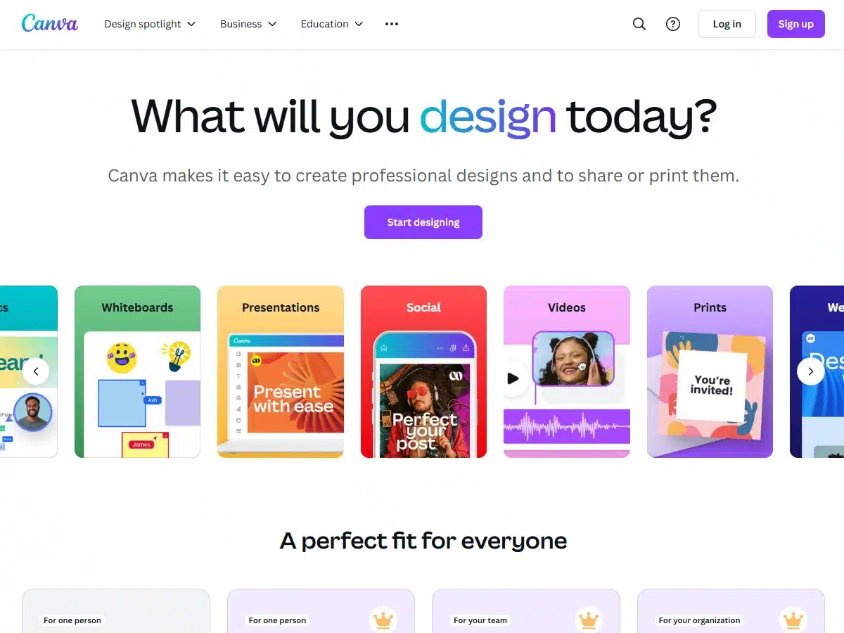
    Source: www.nike.com

    4. Nike

    Nike’s website design embodies the brand’s ethos of innovation and performance. The dynamic visuals, bold typography, and interactive features showcase Nike’s latest products and campaigns in a visually engaging way. The seamless integration of e-commerce functionality makes it easy for customers to shop for their favorite athletic gear.

    5. Spotify

    Spotify’s website design is all about creating a personalized and immersive music experience. The curated playlists, personalized recommendations, and seamless playback feature make it easy for users to discover new music and enjoy their favorite tunes. The sleek interface and intuitive navigation enhance the overall user experience.

    In conclusion, these iconic website designs have set the standard for excellence in the digital realm. By combining creativity, functionality, and user-centric design principles, these websites have redefined the way we interact with online content. Whether you’re a tech enthusiast, a travel junkie, a fitness buff, or a music lover, these websites offer a captivating and seamless browsing experience that leaves a lasting impression. Emulate the best practices from these designs to create a website that not only looks great but also delivers a memorable user experience.

  • The Evolution of Website Design: Unveiling the Top Designs that Redefined Creativity and User Experience

    The Evolution of Website Design: Unveiling the Top Designs that Redefined Creativity and User Experience

    Title: The Evolution of Website Design: A Look at the Best Designs of All Time

    Introduction:

    Website design has come a long way since the early days of the internet. From simple, text-heavy pages to visually stunning and interactive websites, the evolution of design has been nothing short of remarkable. In this article, we will explore some of the best website designs of all time that have set new standards for creativity, functionality, and user experience.

    The Best Website Designs in All Time:
    Source: sage.agency

    The Best Website Designs in All Time:

    1. Apple – Apple’s website design is a masterclass in simplicity and elegance. With clean lines, white space, and high-quality images, Apple’s website showcases their products in a visually appealing way. The intuitive navigation and seamless user experience make it easy for visitors to explore and shop for Apple products.

    1. Airbnb – Airbnb’s website design is a perfect blend of functionality and aesthetics. The use of vibrant colors, engaging photos, and intuitive search features make it easy for users to find and book accommodations worldwide. The responsive design ensures a seamless experience across devices.
    2. National Geographic – National Geographic’s website design reflects the brand’s commitment to storytelling and visual excellence. The use of stunning photography, immersive videos, and interactive maps creates an engaging experience for visitors. The clean layout and easy navigation make it a pleasure to explore the site’s content.
    3. Google – Despite its minimalist design, Google’s website is a prime example of effective user interface design. The iconic search bar, clean layout, and fast loading times make it one of the most user-friendly websites on the internet. Google’s design philosophy of simplicity and functionality has stood the test of time.
    4. The New York Times – The New York Times website design is a testament to the power of content and storytelling. With a clean layout, easy navigation, and high-quality journalism, The New York Times website delivers a premium reading experience. The use of multimedia elements and interactive features enhances user engagement.

    Conclusion:

    The best website designs of all time share common characteristics such as simplicity, functionality, and user-centric design. By prioritizing user experience, visual appeal, and seamless navigation, these websites have set new standards for design excellence. As technology continues to evolve, we can expect even more innovative and inspiring website designs in the future.

  • The Evolution of Website Design: Unveiling the Most Impactful Designs in History

    The Evolution of Website Design: Unveiling the Most Impactful Designs in History

    Title: The Evolution of Website Design: A Look at the Best Designs of All Time

    Introduction:
    Website design has come a long way since the inception of the internet. From simple, text-heavy pages to visually stunning, interactive websites, the evolution of design has been remarkable. In this article, we will explore some of the best website designs of all time that have set new standards in creativity, functionality, and user experience.

    Evolution of Website Design:

    1. The Space Jam Website (1996): Considered one of the first websites to utilize animations and interactive elements effectively, the Space Jam website captured the essence of the movie in a visually engaging way.
    2. Apple Website (2000s): Apple revolutionized website design with its minimalist approach, clean layouts, and intuitive navigation. The use of high-quality images and seamless user experience set a new benchmark for the industry.
    3. Airbnb Website (2010s): Airbnb’s website design focuses on immersive visuals, personalized content, and intuitive search features. The use of user-generated content and storytelling elements creates a sense of trust and authenticity.
    4. Stripe Website (2020s): Stripe’s website design showcases a perfect blend of functionality and aesthetics. The clean, modern design, coupled with easy navigation and concise information, reflects the company’s commitment to simplicity and efficiency.
    5. Key Elements of Best Website Design:

    6. Responsive Design: Websites that adapt seamlessly to various devices and screen sizes provide a consistent user experience.
    7. Intuitive Navigation: Clear and logical navigation paths help users find information quickly and easily.
    8. Visual Hierarchy: Effective use of colors, typography, and imagery to guide users’ attention and convey information hierarchy.
    9. Accessibility: Websites that are accessible to users with disabilities, ensuring inclusivity and compliance with web standards.
    10. Performance Optimization: Fast loading times, optimized images, and clean code contribute to a smooth user experience.
    11. User-Centric Design: Putting the needs and preferences of users at the forefront of design decisions leads to more engaging and user-friendly websites.

    Conclusion:
    The best website designs of all time share common characteristics such as functionality, aesthetics, user-friendliness, and innovation. By studying these exemplary designs, we can gain insights into the evolving trends and best practices in website design. As technology continues to advance, we can expect even more groundbreaking designs that push the boundaries of creativity and user experience.

  • Top 5 Best Website Designs of All Time: Inspiring Innovation and User-Centric Excellence

    Best Website Design in All Time

    In the ever-evolving world of web design, certain websites stand out as pioneers in setting the standard for excellence. These websites not only showcase innovative design elements but also prioritize user experience, functionality, and aesthetics. Let’s explore some of the best website designs of all time that have left a lasting impact on the digital landscape.

    Apple

    Apple’s website is a prime example of minimalist design at its best. With clean lines, ample white space, and high-quality product imagery, Apple’s website exudes sophistication and elegance. The intuitive navigation and seamless user experience make it a pleasure to browse, while the consistent branding elements create a cohesive visual identity across the site.

    Airbnb

    Airbnb’s website is a masterclass in storytelling through design. The use of immersive imagery, engaging videos, and personalized recommendations creates a sense of wanderlust and adventure for users. The intuitive search functionality and interactive map features make it easy to find and book accommodations, while the user-generated content adds authenticity and social proof.

    Google

    Google’s homepage is a testament to the power of simplicity. With just a logo, search bar, and minimalistic design, Google has perfected the art of delivering a clutter-free user experience. The fast loading times, responsive design, and straightforward layout make it easy for users to focus on what matters most – the search functionality.

    Spotify

    Spotify’s website seamlessly combines form and function to create an immersive music streaming experience. The bold typography, vibrant color palette, and dynamic animations capture the essence of music and creativity. The personalized recommendations, curated playlists, and social sharing features enhance user engagement and encourage exploration.

    National Geographic

    National Geographic’s website embodies the spirit of exploration and discovery through its captivating visuals and compelling storytelling. The stunning photography, interactive maps, and in-depth articles transport users to far-off places and deep into the heart of nature. The seamless integration of multimedia elements and user-friendly navigation make it a joy to explore the world through National Geographic’s lens.

    Conclusion

    The best website designs in all time share common elements such as intuitive navigation, responsive design, captivating visuals, and seamless user experience. By prioritizing user needs and leveraging innovative design techniques, these websites have set the benchmark for excellence in the digital realm. As we continue to push the boundaries of web design, let these iconic websites inspire us to create memorable and impactful online experiences for users around the globe.